SINAI
A leading enterprise software platform that helps companies, to measure, analyze, report, and strategically reduce their carbon emissions for effective decarbonization. It provides tools for detailed carbon accounting, scenario planning with AI-driven insights, financial modeling for carbon costs, and integrates sustainability into core business strategy.
My role was Lead Designer for brand strategy, visual systems, and web design.
Challenge
The website needed a revamp that would elevate the business beyond generic “eco-friendly” visuals. The goal was to create clear separation across multiple services, but with the logo set in stone and minimal supporting assets, the challenge was to build a cohesive, scalable experience with limited resources.
Fresh Air
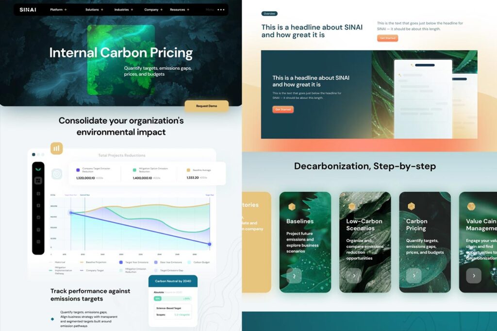
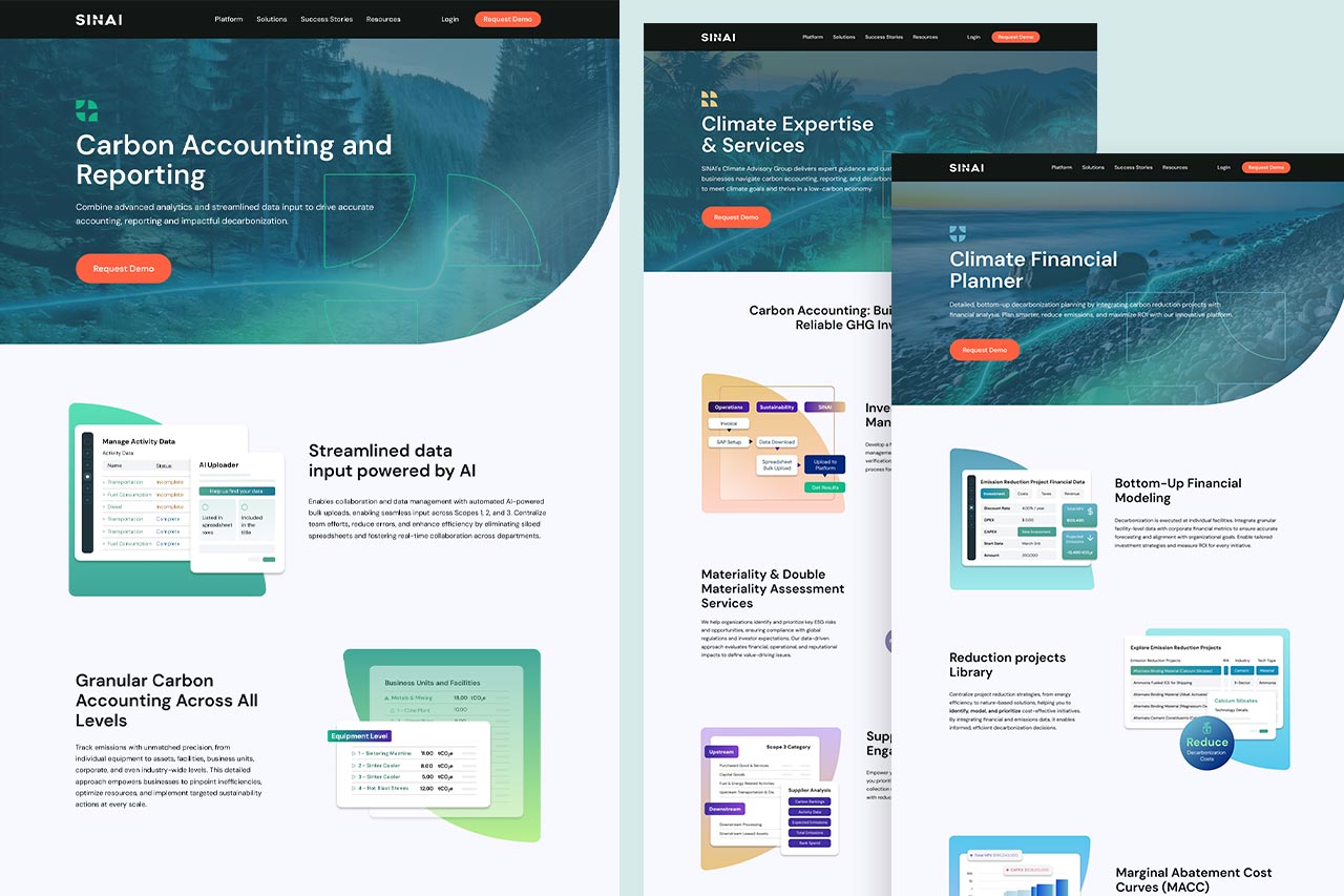
Instead of doubling down on typical environmental cues of the original design, the brand was reframed through a fintech lens: clean, precise, and data-driven. This strategic pivot positioned Sinai as a serious, innovative force in decarbonization – professional and approachable, yet fresh, like a breath of clean forest air. The approach aligned with current trends in tech-forward sustainability, emphasizing structure, clarity, and measurable impact over conventional “eco” tropes.
Extracting Identity
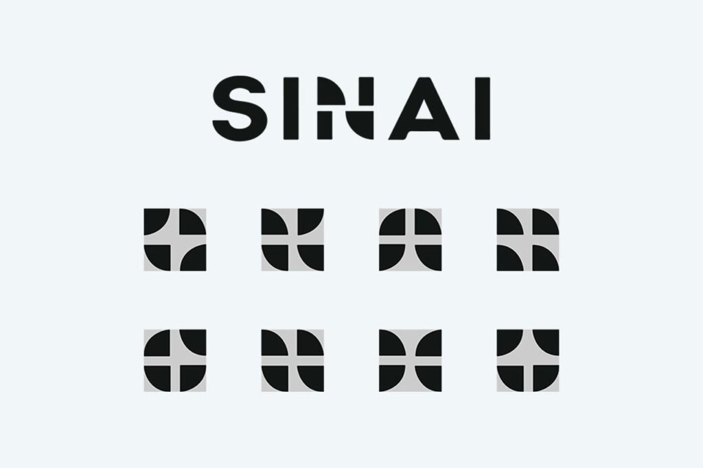
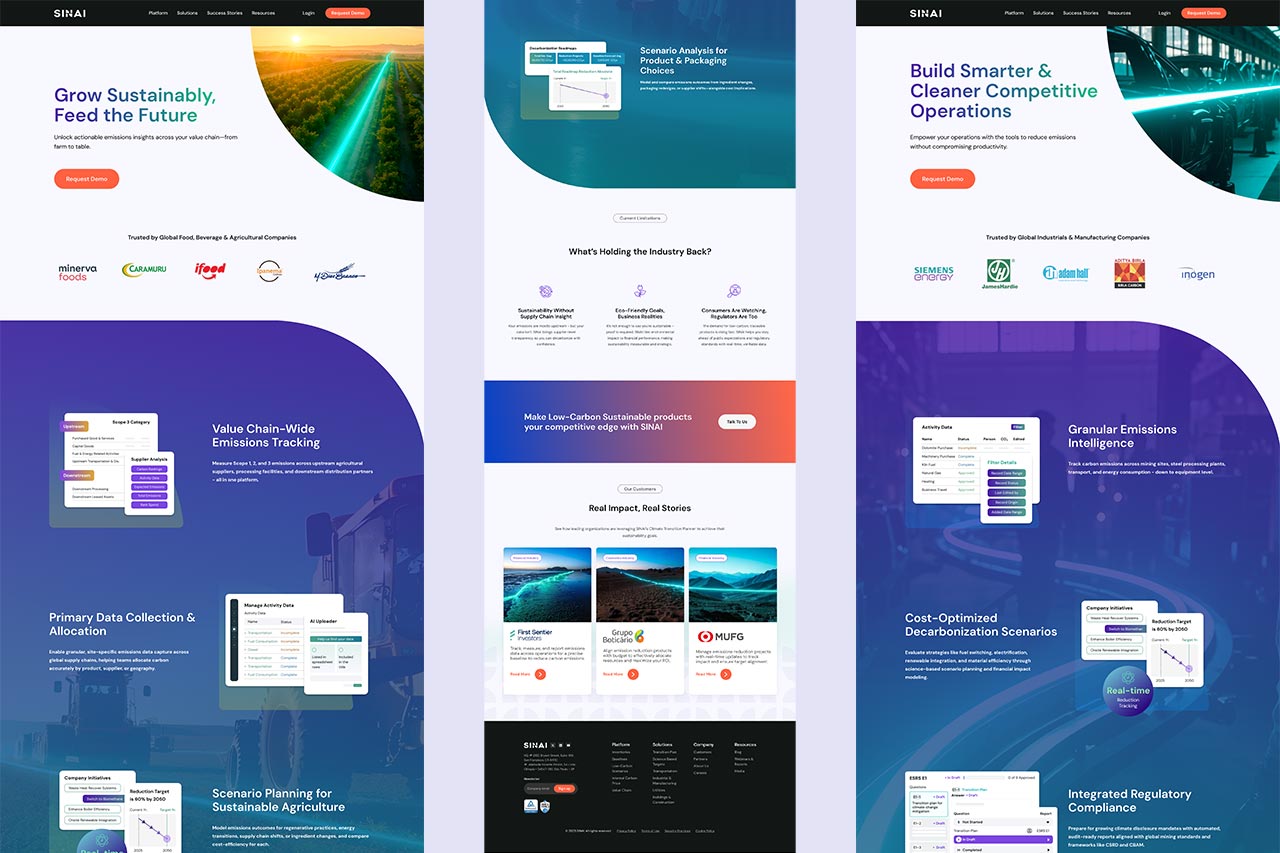
With the logo as the sole anchor, its distinctive “wedges” were extracted to form a modular iconography system. This system subtly differentiated each service, providing clear visual cues without unnecessary complexity. An expanded color palette further enhanced separation, ensuring each service was identifiable at a glance while maintaining overall brand cohesion. Together, these elements created a flexible visual language that could adapt across both the website and broader brand materials.
Designing for Access
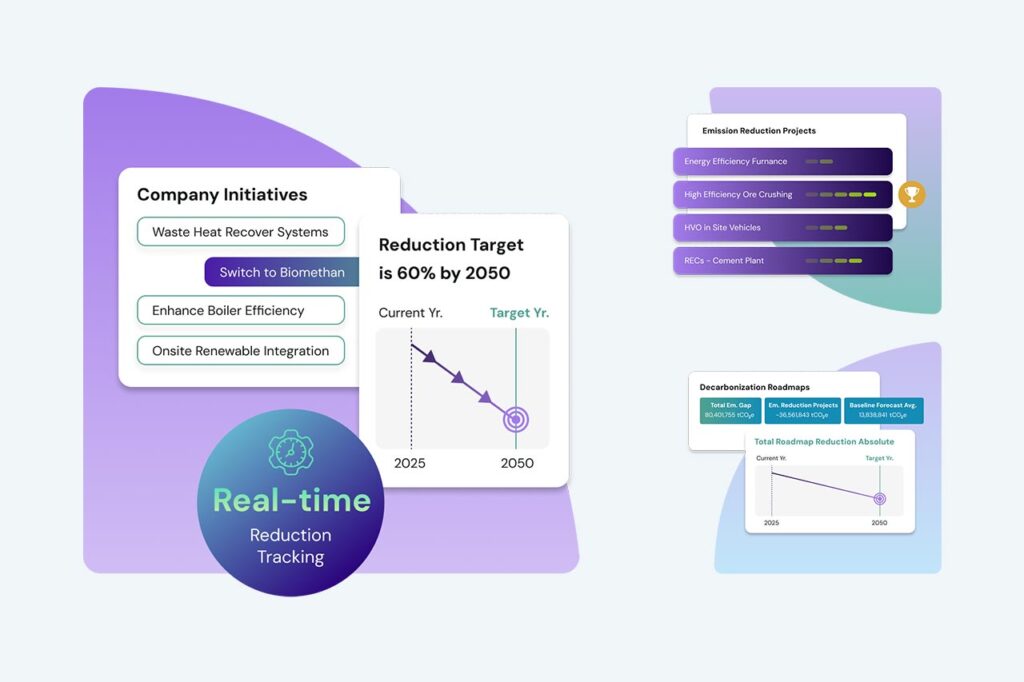
Simplified infographics became a core tool to communicate key data in an engaging, digestible way. Each graphic was designed to convey information at a glance, reducing reliance on long-form text while keeping users informed and engaged.
To maintain service clarity, sets of infographics were subtly connected to their respective services through color coding, while remaining flexible enough to be retooled or reassigned as the brand evolved.
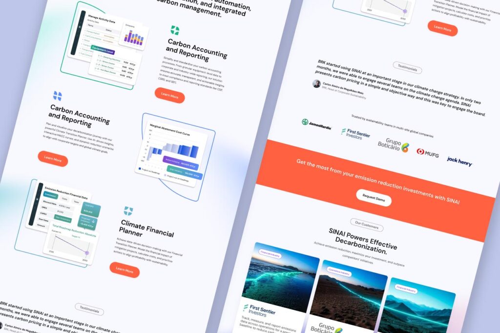
Sections, supporting assets, and imagery were designed as reusable components, allowing Sinai to communicate clearly across services without losing cohesion.
Technical considerations, such as Web Content Accessibility Guidelines (WCAG) and development requirements, also influenced overall structure, color and hierarchy, reinforcing the need for simplification and accessibility.

Empowering Business
The new website design and modular brand system extended beyond visuals, forming a scalable structure the internal team could adopt and maintain with ease and confidence.
The end result was a fully adaptable, future-ready solution that empowered the team to continue driving clarity, engagement, and innovation independently.